

Web design is more than just a combination of colors and graphics. At its core, it revolves around creating an intuitive user experience, seamlessly blending visual elements, and facilitating interactions. Every button, image, and line of text plays a pivotal role in how a visitor perceives a brand. Often, the web design company you choose can make or break your digital presence. Remember, a website often serves as the first impression of a brand or company. Therefore, it’s essential to ensure this impression is a positive and lasting one.
As the digital age progresses, the concept of website design has evolved, embracing not only aesthetics but also functionality and accessibility. From responsive layouts catering to a variety of screen sizes to designs that account for those with disabilities, modern web design is about inclusivity. The best designs not only appeal to the eye but also to a diverse range of users, catering to their individual needs.
There are many factors to keep in mind when designing a website. First of first, designs must be functional yet aesthetically pleasing. No website can appeal to everyone, but some common web design mistakes turn visitors away from websites. Below you will find 10 most common ones. If you are planning to build your own website, this list is for you.
Check out 10 Most Common Web Design Mistakes…
10 – Confusing Navigation
Navigation is the only way people can go around your website. Having confusing navigation will result in visitors getting frustrated usually leaving your website without spending too much time.
09 – Using Flash
It is 2013 now and flash doesn’t work anymore. Especially with slow computers and apple devices. Also flash websites aren’t that much SEO friendly. Better use JavaScript and stay away from flash content.
08 – Auto Playing Sounds and Videos
There is nothing more annoying then visiting a website with autoplay sounds. Your visitors may be at work, in a library or somewhere else where loud audio will result in navigating away from your website as quickly as possible!
07 – Large and Uncompressed Image Files
You should reduce the size of your image before uploading them to your website. Nowadays, jpeg file format is the most popular and user friendly image format for webmasters. You can prefer PNG over jpeg for transparent background logos too.
06 – Annoying Pop Up Windows
Do you like when someone interrupts you by shoving a piece of paper in your face? Well, your website visitors won’t like it, either, when you pop up something over what they’re trying to read or watch. Of course, we are using one too, but it is just Facebook page and only shows once a day.
05 – Too Many Advertisements
Banner advertisements have the huge power of making you lose potential customers and visitors. If ads are your main monetization strategy, leave them on your blog, but if you are selling a product or a service, you should delete them!
04 – Low or high contrast
White text on a black background may look nice from a design perspective, but it will hurt your visitors eyes. Don’t make reading your content more difficult than it has to be. Do your visitors a favor and make the text on your site easily readable.
03 – Not Using a Search Box
The web is like an archive of information. Whether it’s a corporate website, webzine or a personal blog, a search box is essential. The visitor might be looking for something that is hidden within the website. With the help of a search box, visitors may get what they want.
02 – Using Too Many Elements
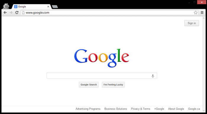
While you want to go for an aesthetically pleasing layout, there is a fine line between good web design and overly complicated web design. You will want to keep your color scheme simple and avoid using too much imagery that distracts from the functionality of the website. Remember how google has succeeded with its simplicity design!
01 – Optimizing Your Website For Mobile Devices
Mobile web traffic now accounts for more than 20 % of global Internet traffic, and it’s scaling faster than the desktop did. If your website is not mobile enabled, you’re going to miss out on a growing population of users.
Why Web Design Is Important For Business
In today’s digital landscape, a website serves as the front door to any business. It’s where potential customers, clients, and partners find crucial information, form first impressions, and often make decisions. An effective website can amplify a brand’s message, build trust, and drive conversions.
However, committing common web design mistakes can have the opposite effect. Poor design choices can confuse visitors, bury important information, and even affect a website’s loading speed. For businesses, especially small retail business, this can mean the difference between gaining a loyal customer or losing them to a competitor.
In essence, investing in quality web design isn’t just about aesthetics. It’s about ensuring user-friendliness, optimizing for conversions, and enhancing overall user experience. In an era where online reputation can significantly impact a brand’s success, paying attention to design can no longer be an afterthought.