
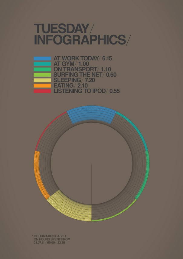
Ryan Atkinson is a creative and hardworking graphic designer from Dubai who is behind the project called ‘’ 365.25 Typographic Journal’’. Ryan says that; the idea of this project is to do a new experimental design everyday for one year. He decided to start this project to keep himself inspired and motivated to keep thinking and moving forward. It has proven rather tough to discipline himself to do a design a day, especially if he doesn’t have the time. As you will see certain themes began to develop, for example: on Mondays, he does a new logo or mark & Tuesdays is infographic style and so forth. He says he will be updating this project monthly for a year. To follow his upcoming inspiring typography designs, just visit his official behance profile which you can find the link below.
Check out 10 Most Elegant Typography Design Examples By Ryan Atkinson.
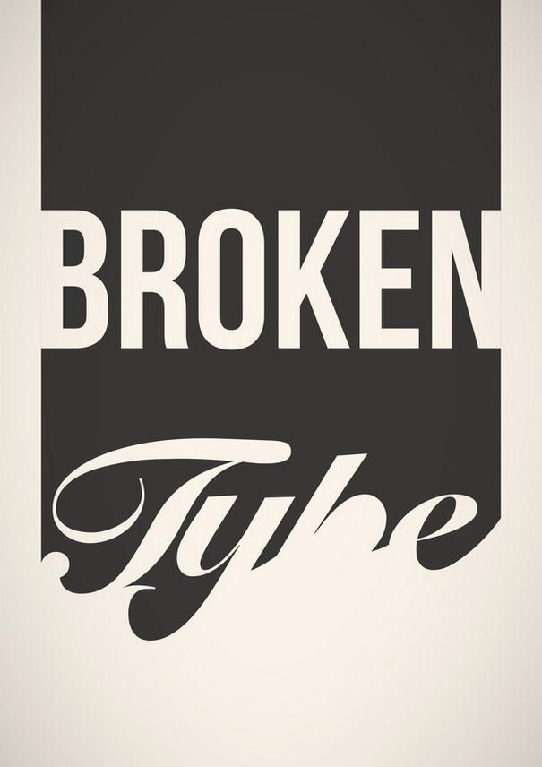
10 – 365.25 Typographic Journal By Ryan Atkinson
09 – 365.25 Typographic Journal By Ryan Atkinson
08 – 365.25 Typographic Journal By Ryan Atkinson
07 – 365.25 Typographic Journal By Ryan Atkinson
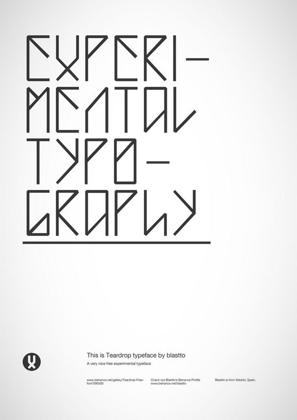
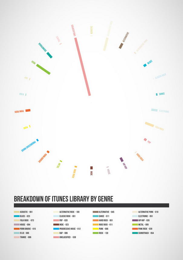
06 – 365.25 Typographic Journal By Ryan Atkinson
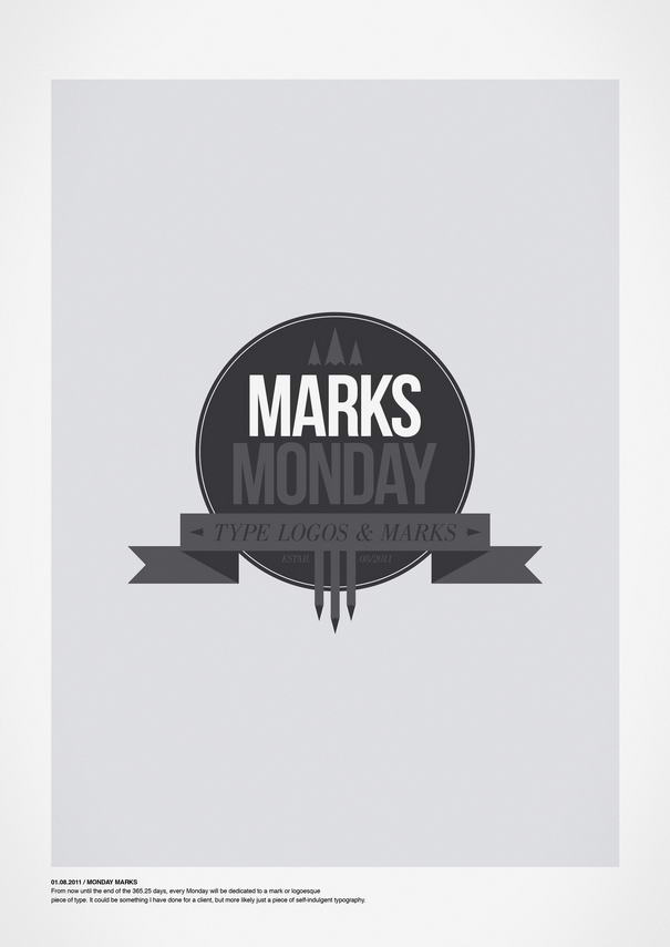
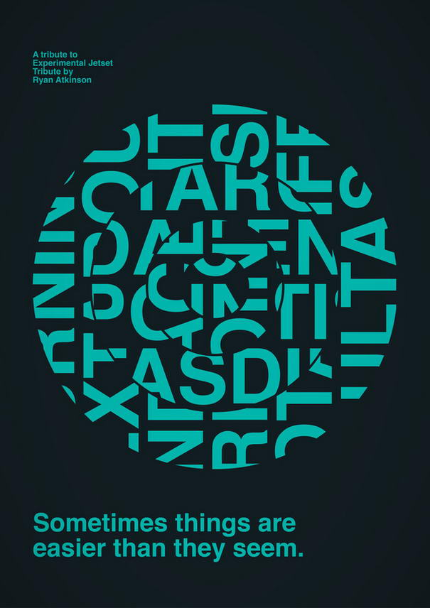
05 – 365.25 Typographic Journal By Ryan Atkinson
04 – 365.25 Typographic Journal By Ryan Atkinson
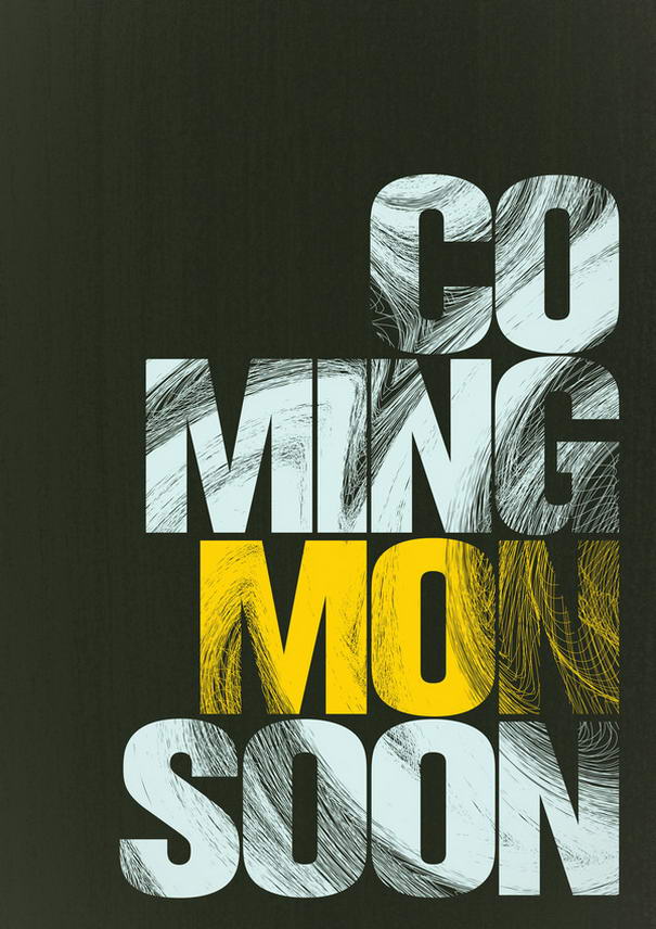
03 – 365.25 Typographic Journal By Ryan Atkinson
02 – 365.25 Typographic Journal By Ryan Atkinson
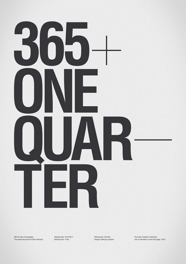
01 – 365.25 Typographic Journal By Ryan Atkinson
Who created typography?
Typography’s allure lies not just in its present, but also its rich past. Before the likes of Ryan Atkinson graced the scene, the art form had already embarked on its journey.
The seeds were sown by the Sumerians with their cuneiform script around 2000 BC. However, the true evolution began with the brainchild of one man: Johannes Gutenberg. In the 15th century, Gutenberg’s printing press emerged, heralding a new era. This wasn’t just an invention; it was the dawn of modern typography.
From then till now, many have shaped its journey. Artists like Atkinson have added new chapters, but the story began with Gutenberg, a testament to human ingenuity and the ever-evolving canvas of visual communication.
In today’s digital age, the principles that originated from Gutenberg’s era still find relevance, especially in areas like flyer print designs, where typography plays a pivotal role in capturing audience attention.
Cracking the Code: What Makes Typography Tick?
Typography, at its core, is more than just arranging letters in a visually pleasing manner. It’s about communication, aesthetics, and above all, connecting with the audience. But what elevates a simple text layout into a compelling typography design?
Legibility sits at the throne. An artistic arrangement loses its charm if the audience struggles to decipher it. It’s here that balance steps in, ensuring the right mix of size, spacing, and font type.
Then comes contrast. Using contrasting typefaces or color schemes can elevate a design, making the content stand out. However, while experimenting is good, consistency remains key. Uniform font types, sizes, and colors across a layout enhance clarity and visual appeal.
Hierarchy, often overlooked, is crucial. The flow, guiding the viewer’s attention from primary to secondary information, makes or breaks a design.
In the vast sea of typography design art, Ryan Atkinson’s designs stand out, embodying these principles. They’re not just layouts; they’re narratives, eloquently told through the dance of letters and spaces.
via: 365.25 Typographic Journal