
Packing a punch with their simplistic charm, the minimalist packaging designs by Antrepo Design are nothing short of a visual treat. With a sharp focus on functionality while maintaining an appealing aesthetic, their work has indeed redefined the packaging design industry. Minimalist design has always held a strong footing in the world of aesthetics, finding its application in various domains from architecture to fashion. And when it comes to product packaging design, less is often more, and Antrepo has undeniably mastered this art. Breaking free from excessive detailing, their designs primarily revolve around emphasizing the fundamental features, leading to highly impactful creative packaging.
An excellent initiative from the Antrepo Design Product studio with a minimal deconstruction of international brands in consumer products such as Nutella, Red bull, Durex, Pringles and others. I have to admit that most of the reconstructed packages look much better.
”Our last project is about simplicity and we try to find alternate simple version for some package samples of the international brands. We think almost every product needs some review for minimal feeling.”
Here are 10 Most Effective Minimalist Packaging Designs By Antrepo Design…
10 – Toffifee

09 – Schweppes

08 – Red Bull

07 – Nesquik

06 – Mr Muscle

05 – Excellence

04 – Durex

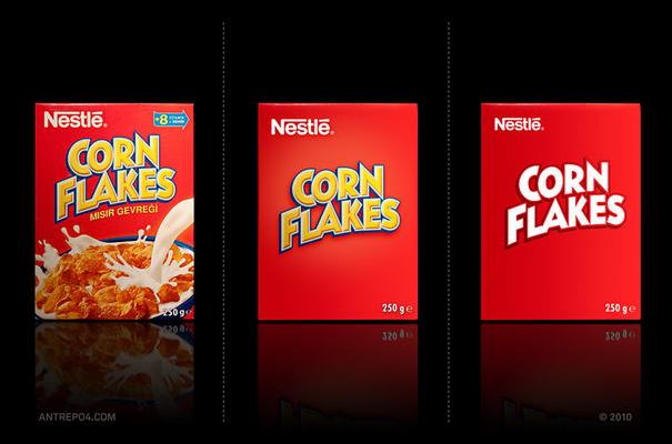
03 – Corn Flakes

02 – Pringles

01 – Nutella

The Hallmarks of Minimalist Packaging Designs
Simplicity is the ultimate sophistication, they say, and when it comes to minimalist packaging, this couldn’t be more true. The minimalist approach is not merely about subtracting elements from a design; it’s about carefully selecting and refining the elements that are necessary and removing those that are not.
The first characteristic of minimalist packaging is the less-is-more approach. This means reducing clutter and focusing on the essentials. The second is a focus on functionality. Each element of the design should serve a specific purpose. Next is clarity and openness in design. With minimalist packaging, the aim is to create a design that is immediately understood by the viewer. It is about stripping away all that is unnecessary to reveal the essence of the product.
Lastly, minimalist packaging often uses a limited color palette. This doesn’t mean the design has to be monochrome or black and white, but it usually involves two or three colors at most. This aids in creating a strong visual impact and allows for a more focused brand message.
In conclusion, Antrepo Design’s minimalist packaging designs are perfect examples of minimalism done right. Their creations beautifully capture the essence of the products they envelop, delivering the brand message with utmost clarity and impact. Their works continue to inspire and influence the world of packaging designs, proving that the simplest of designs can create the most substantial impressions. So, next time you come across a minimalist packaging design, take a moment to appreciate the artistry and thought that goes into creating such streamlined and effective packaging. After all, it’s the simple things that are the most extraordinary.
Source: Antrepo Design